Layouts
SaaS landing page layouts: 90 section wireframes
Every SaaS landing page is built from the same kinds of sections: a hero, proof, features, pricing, an FAQ and a closing call to action. Here are the layouts the best SaaS homepages use for each section, drawn as clean wireframes you can reuse, with when to use each one.
The wireframes are free to use under CC BY 4.0. Credit “Wireframes by BlockSnap” with a link to blocksnap.site. CC BY 4.0

02 · 8 layouts
Hero
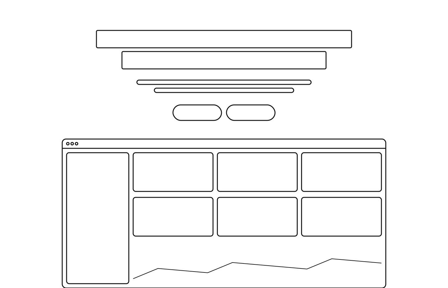
Say what the product is and for whom, then show it. Everything else on the page depends on the visitor understanding this first screen.
03 · 6 layouts
Customer logos
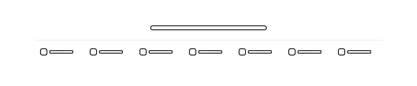
Prove that real teams already trust the product. The logos do the talking, so the visitor reads the features with that trust in mind.
04 · 8 layouts
Features
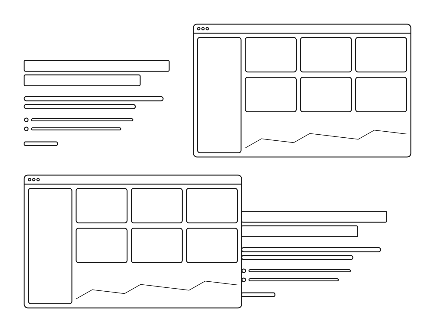
Explain what the product does, one benefit at a time. Each part should answer one question a visitor has, and show the product doing it.
05 · 6 layouts
Product tour and how it works
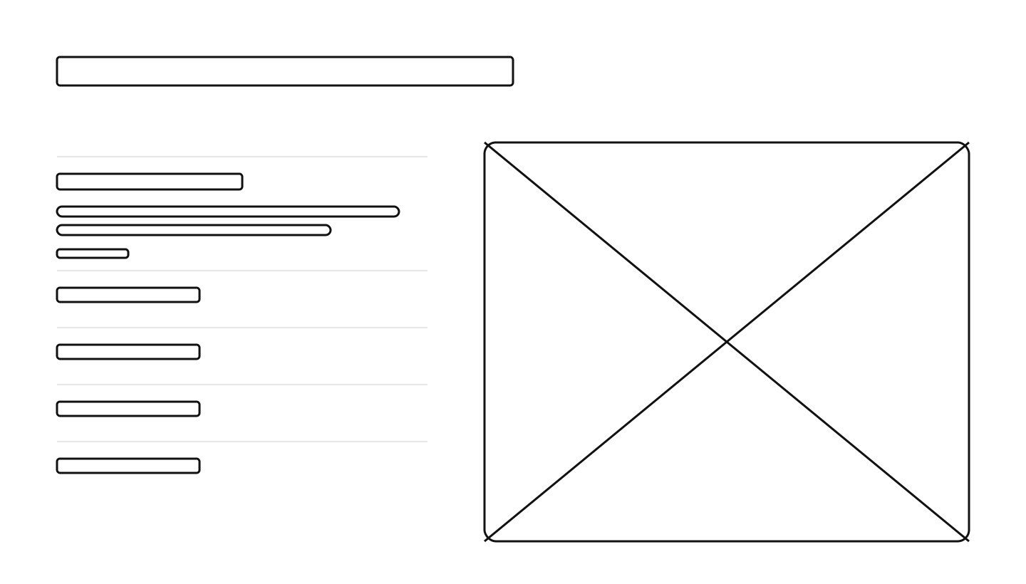
A product tour walks visitors through the main parts of the product, one view at a time. A how it works section shows the few steps from sign-up to result.
06 · 4 layouts
Use cases
A use cases section shows how different teams, roles or industries use the product. It helps each visitor find the part that fits them.
07 · 7 layouts
Testimonials
Let customers say it, so the page does not have to. A real person with a real result is more convincing than any claim the company makes about itself.
08 · 4 layouts
Stats and numbers
A stats section turns scale into proof with a few big numbers and short labels. It often sits after the logos or near the end of the page.
09 · 6 layouts
Trust, security and awards
A trust section answers the buyer's fear of risk. It shows awards, analyst reports or security and compliance seals.
10 · 5 layouts
Integrations
An integrations section shows that the product fits the tools a team already uses. It lowers the fear of switching and links to the full directory.
11 · 5 layouts
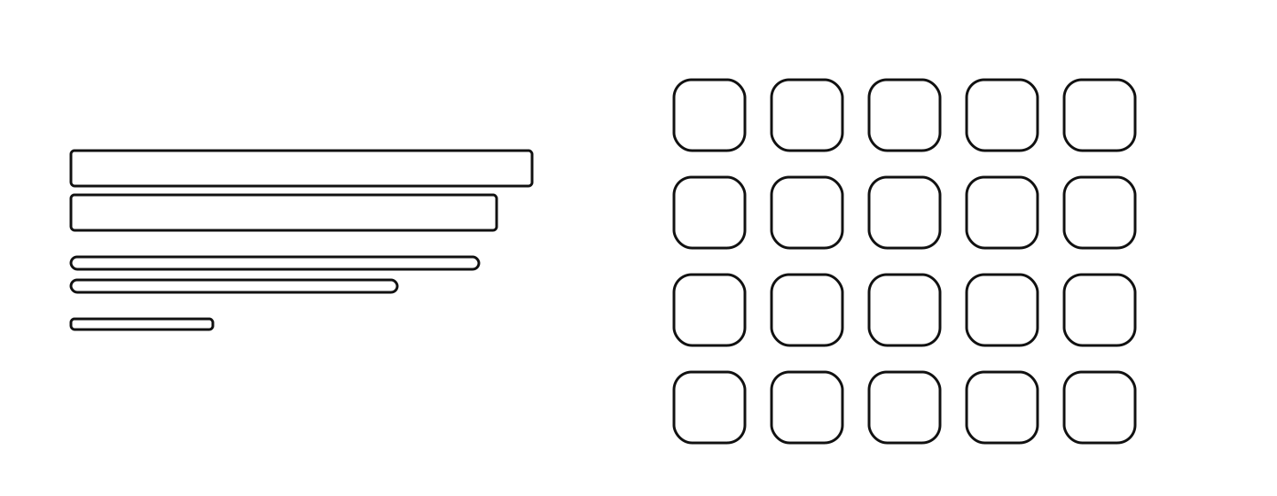
Pricing
Answer “what does it cost?” without stopping the story. Visitors who know the price is fair, or that they can start free, keep reading.
12 · 5 layouts
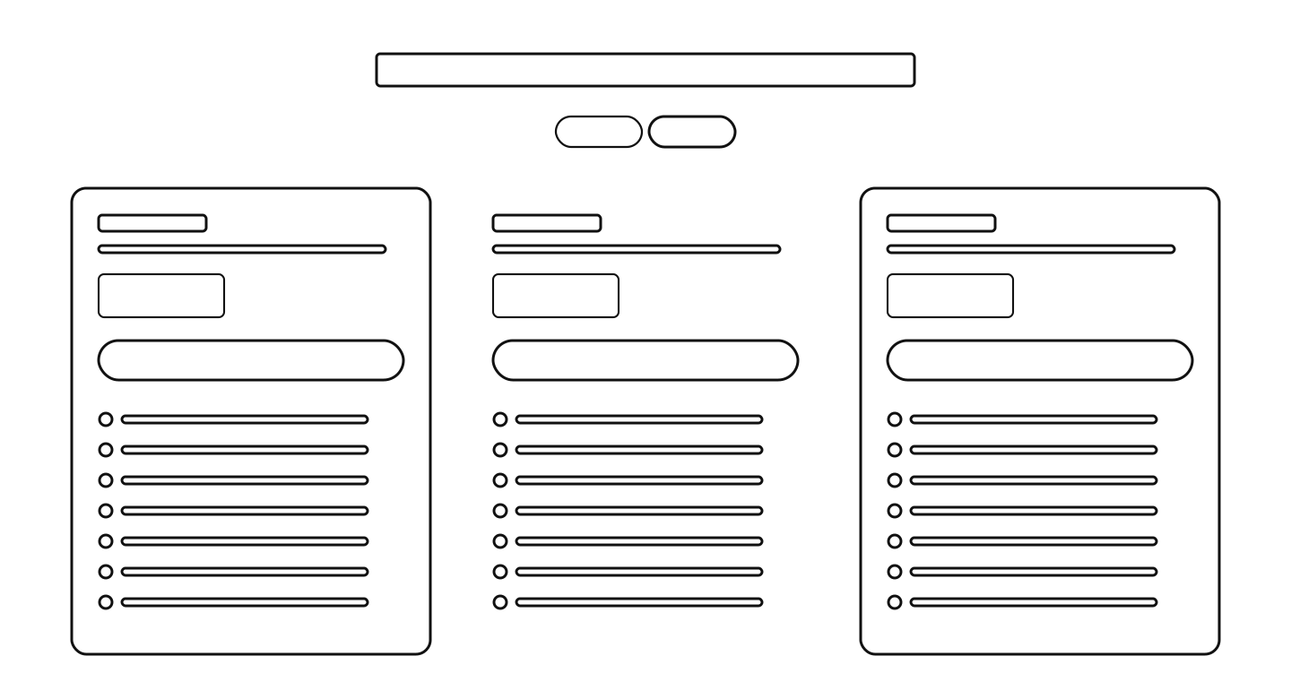
FAQ
Remove the doubts that stop a sign-up. Visitors who are almost ready to start look here for the one answer they still need.
13 · 8 layouts
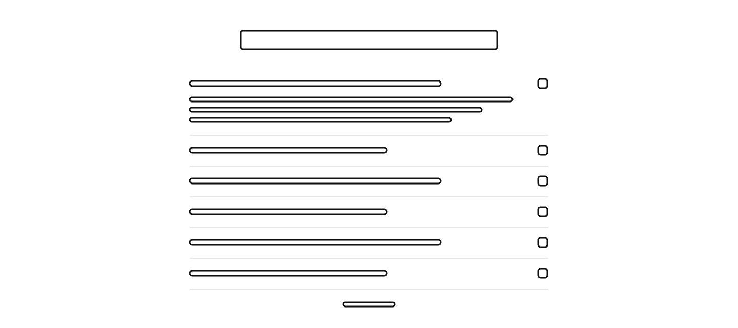
Call to action
Ask once more, clearly, for the one action. A visitor who read the whole page is ready to decide, so make the next step obvious.
14 · 5 layouts
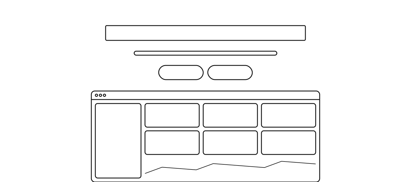
Resources and blog
A resources section near the end of the page points to recent posts, news, guides and docs. It shows the company is active and gives visitors a next step to learn more.
Questions about these layouts
- What sections does a SaaS landing page need?
- Most strong SaaS homepages use nine: navigation, a hero, customer logos, features, testimonials, a pricing teaser, an FAQ, a closing call to action and a footer. Tours, use cases, stats, trust badges and integrations are common extras.
- Can I use these wireframes in my own work?
- Yes. They are free to use under CC BY 4.0, also for commercial work. Credit “Wireframes by BlockSnap” with a link to blocksnap.site.
- Which hero layout should a SaaS homepage use?
- The two most common are the centred stack with the product below and the split with text on the left. Pick the centred stack when one wide screenshot tells the story, and the split when the words should lead.
- How do I turn these layouts into a real page?
- Describe your product in one sentence and BlockSnap writes and lays out the whole page with these layouts. You can then snap any section to another layout without losing your words.
Pick a layout for every section. Keep your words.
BlockSnap builds the whole page from one sentence, using these layouts. Snap any section to another layout and the copy moves with it.
Get early access